By: MJ + PJ
One of the main reasons we have created this site, and are listing our travel statistics, is for others contemplating this type of venture to get a feel for the nitty gritty of it. It is for you to see what it looks like on the day to day level.
In all of the websites and books we scoured and read in our preparation, we saw plenty about general costs and considerations, but nothing we could grab onto to see how it panned out on a day to day basis. The reason you do not see this is because every long term travel trip is going to be different: different places, different times and durations, different travel habits, different food and accommodation preferences, etc. Our own hesitancy in planning the trip often returned to this, creating doubt at times.
No one will travel exactly like we have. We set the budget for the year we travel at USD$150/day, this being $50 each person. If you traveled only in Europe and stayed mostly in hotels, this budget would be impossible. The same goes for the North America leg of the adventure – some regions and continents are just more expensive. The good news is that some regions are less expensive, and this can help swing the over budget travel back towards your target budget.
There are big expenses that are occasional. These being things like car repairs, cross continent flights, trans ocean flights, and medical bills. These you have to factor in as outliers, and so you have to aim to keep the usual days at less than $50 each if possible. But you want to have fun and see things, right?! This is where balancing your adventure comes in – there are some things you have listed as ‘must see’, others that are ‘will see if we can’, and others that are ‘wow – that was unexpected’.
But we digress! This post is a brief guide on how to use our 365 DATA page. We have used Google Drive and a Google Sheet to record our daily statistics. One of the plugins we use on our website integrates this sheet into the page so that you can see, search, manipulate variables, and export the data if you wish. It is open source in that sense!
At the top of the sheet you will see the following:

This is where you can toggle each of the columns on or off, copy export or print the data, and adjust the number of entries (10, 25, 50 or 100) that are visible. At the base you will see page numbers and arrows to see any of the multiple pages (once we get beyond 100 days, the row display limit).
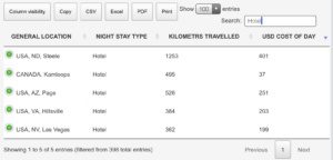
You will also see a search box. Use this to refine the data – it is more responsive to non-numerical searches. This is where exporting can be more useful, as you will have more control over the sorting in programs like Excel or Sheets or Numbers. Specificity on the web page searching is best: “OH” will return rows with any word with OH in it (including words in the comments column; see by clicking on the green + sign), while “OH,” will list you any days we spent in Ohio. Here is an example to show how many days we have used a “hotel” to date:

You can also combine search terms, as in the example below:

You should also be able to order the columns by toggling the arrows at the right side of the column heading. This does not appear to work reliably as far as we can see, so there must be a variable we have not detected yet. For example, we would like to see the most expensive days by toggling the USD Cost of Day column heading. Numerical searches only return specific values, and you cannot search for any < or > values.
Of course, as mentioned before, exporting it into a spreadsheet program is the best way to manipulate the data and overcome these barriers. If you happen to notice any interesting trends or have a nice graph from our data, please share it via email! (This is a good task for a maths or statistics project.)
[The other data on the page: The first two graphs we create by manually updating the tallies of each type of accommodation and distances traveled in a chart plugin on our website. The pie chart shows the percentage of days in each spending bracket. We also have a third graph (line) showing the monthly trends of several key metrics which you may find useful. The final item on the page is a table of notable singular data points. These data are calculated by formulas on the source Google Sheet drawing mostly from the raw data.]
